
The Irish writer Brendan Behan once said: "A quotation in a speech, article or book is like a rifle in the hands of an infantryman. it speaks with authority." So then, it should not be surprising that we see many quotes in various written and spoken media. Quotations can be powerful and can add credibility, gravatas, interest, humor, clarity and a host of other factors to your presention. As long as they are relevant to your overall message they are one of my favorite things to use besides visual imagery.
I got to reflecting on my use of quotations recently after Ellen Finkelstein got an interesting conversation started on her blog recently about using quotes on slides to get your audience's attention and to make your slides more engaging. Craig Hadden (@RemotePoss) was one of us who jumped into the conversation and he provided a link to some tips he had written about, which in turn led me to another great article on the use of quotations in presentations by Andrew Dlugan.
As Craig Hadden points out in his piece, quotations "offer a kind of social proof to support the claims you make" and can add to your credibility if you cite a recognized and relevant source. This signals to the audience that your ideas are part of a bigger collective of thoughts about the topic and that you have done your homework in seeking out other information. Some years back I facilitated a blended learning customer service course and one of the first activities in the online portion was to read a series of quotes by senior leaders of the firm. The students immediately got why customer service was important, not just in general, but specifically for the firm in which they were working. It was one of the most powerful exercises for many of the learners.
Andrew Dlugan's tips also includes the idea that a quotation "reinforces your ideas" by offering "a second voice echoing your claims, but is more powerful than simply repeating yourself in different words." He also makes the excellent point that quotations are repeated, at least in part, because they "off a concise, memorable phrasing of an idea."
By now, hopefully, you are convinced that quotations have earned a place in your presentation toolbox. So, how do we go about making them engaging and memorable. Well, let's go through a few examples that I have used in various projects and see what's what.
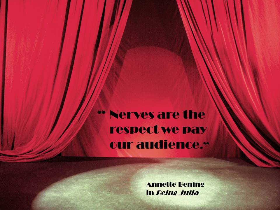
As Annette Bening's character remarks in Being Julia: "Nerves are the respect we pay our audience." It is normal and some would even say necessary for performers and presenters to have some nerves, but how can we present this quote in a good light?
In this case, instead of having an image of the person who authored the quote's image I opted for highlighting the context. There is a stage with the curtains parted, which provides a place for the quoted text to be shown. In the spotlighted area on the stage I added the source of the quote as a stand-in for the person. There is the suggestion of someone on stage, rather than an actual depiction of the person.
One thing that I am not particularly happy with on this slide is the font. I used Broadway, which again is a sort of designer nod to the fact that it is a slide of a stage. The quote is up in lights on the Great White Way of Broadway or some such conceptual notion. The font worked OK for the purpose this slide had but I would caution which picking fonts to be careful with how the slides will be used. Will they work if the slide it full screen in a ballroom or squished down on a mobile phone. You may not have complete control over this, but not every font, even if used at a legible size for most settings, will work well in all settings.
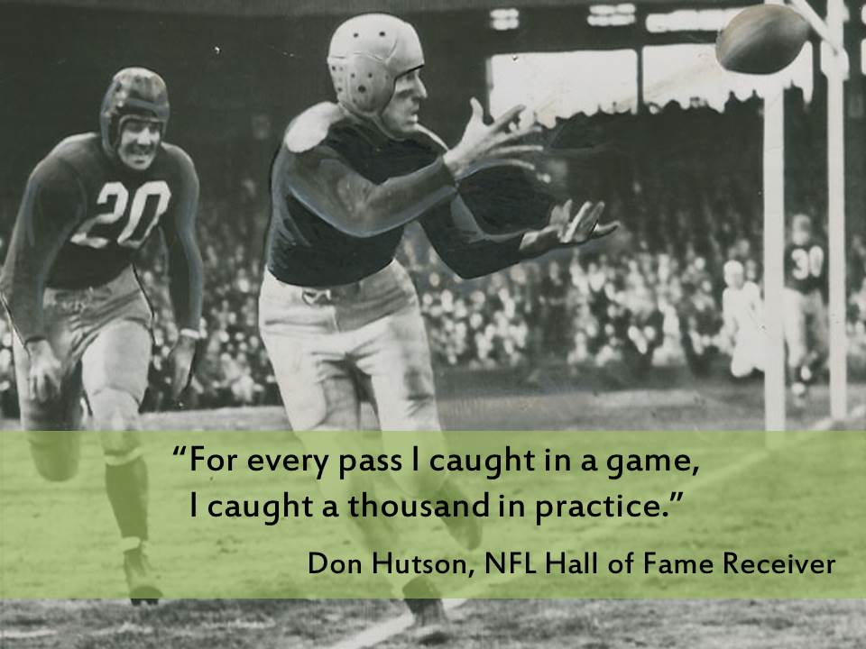
I am a big sports fan so in a presentation about the important of practicing, sports made a good analogy. In this case I did use an actual image. And notice it is spans the whole slide which makes it a canvas on which to display the quote. We'll talk more about using images another time, but for this one the things to notice are that the quote was put in a colored band across the lower portion of the slide in a location that "plays nice" with the image. Put the band up higher and the players bodies would be cut off oddly. Make the band transparent to let a bit of the background image feed through but still enough color to stand out from the image.
In other instances I might have put the band of color down one side of the slide or to the top, depending upon the composition of the image. Or I might have used a color block for the quote text on the side if the image was not large enough to fill the whole screen without being blurry or pixelated.
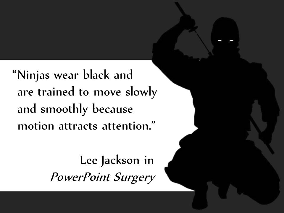
In Lee Jackson's warning about animations in presentations, I used some clipart (egad!) to create a silouetted figure to provide a space for the quote to sit as well as to provide some visual context and interest. The line breaks of the text follow the curve of the ninja's side and make the placement of the text a little more organic than if I just let the text fall where it may. Use line breaks to put text where you want it to go.
The use of the imagery in combination with the text also aids with memory. You may not remember the exact quote at the end of the presentation but the word ninja and the image will remind you that movement on the screen will draw attention. Sometimes that is a good thing, and sometimes that's not. If I am using slides in an elearning context and I animate a circle around a portion of the screen I want the learner to focus on, that's good. If I am just adding flying bullets and images because I think it makes it look cool the audience will be distracted from my message as they follow the animations around the screen like a cat chasing a laser pointer.
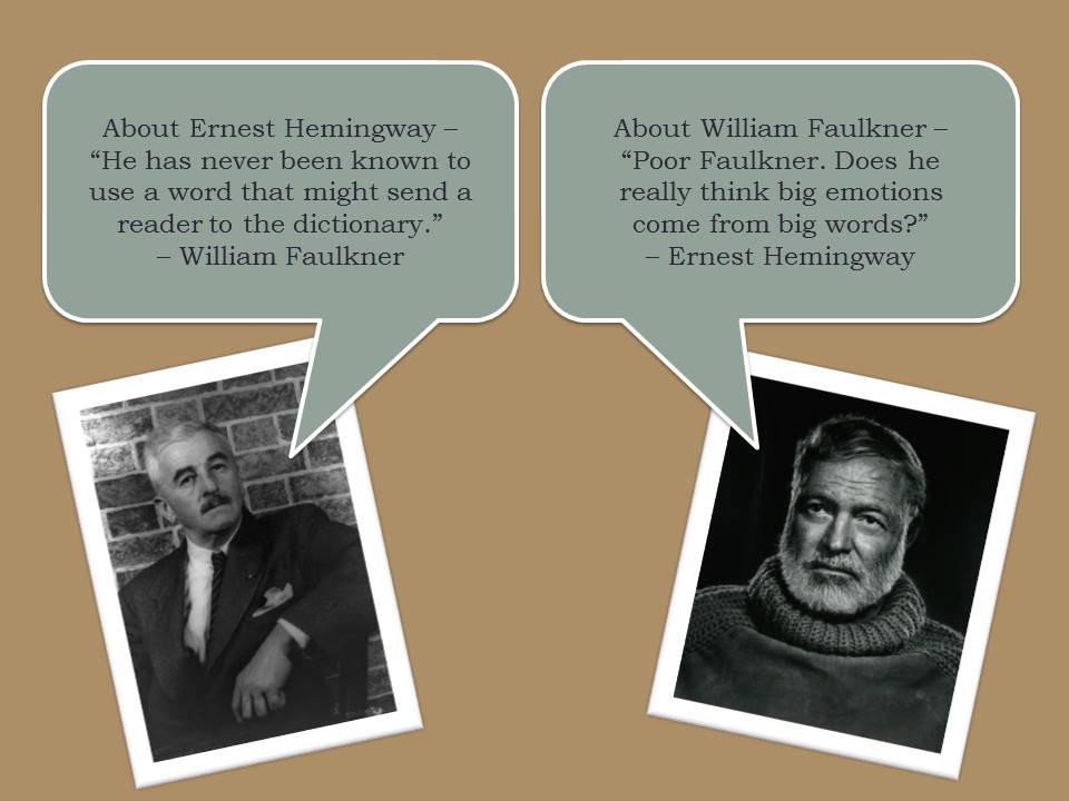
In this final example for today, we see Mr. Hemingway and Mr. Faulkner lamenting one another's writing styles. One of the main things to notice about this slide is that the images of the two men are facing inward, as if they are having a conversation. It is always important to be mindful of what direction people are looking. Generally you want them looking into the middle of the slide and not off of the edge. You also want them facing the words that they said. In this case, to give it a little more of a conversational feel I used speech bubble boxes for the text and made sure that they looked like they were being spoken by each of the men.
Well, that's if for today. Try out making over some of your slides that have quotations. These examples are just a few of the things you can do with quotations. Be creative and share what you come up with.